COVIDcast
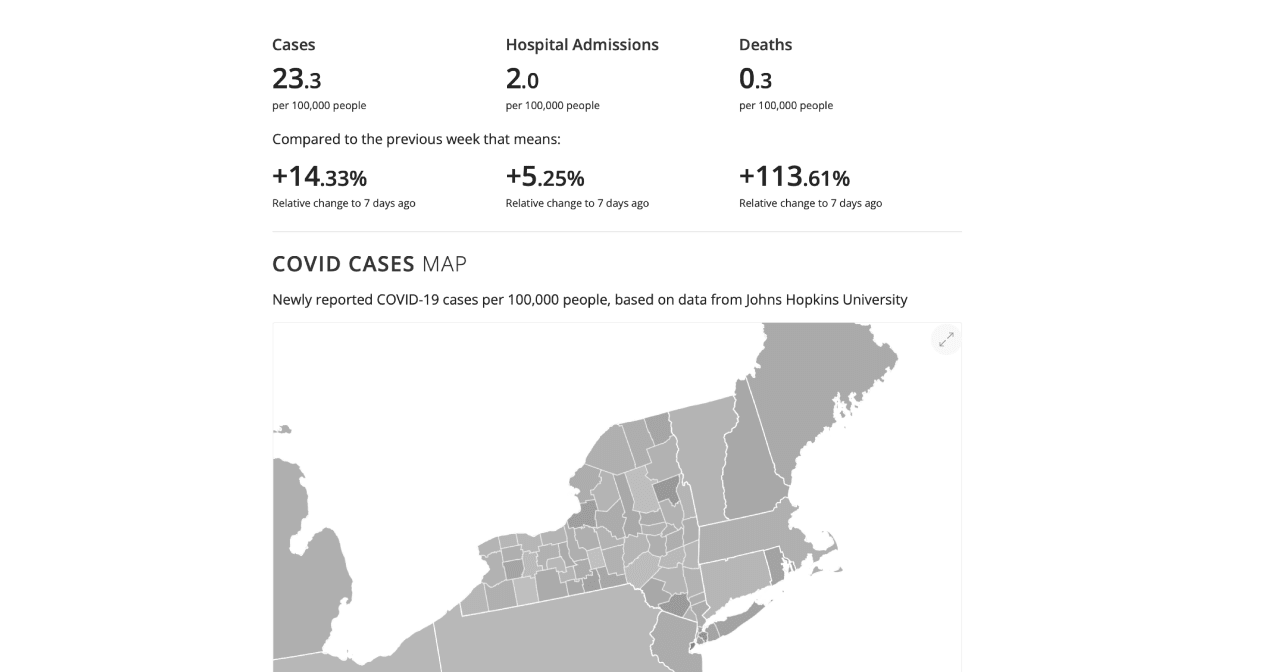
During the early COVID-19 pandemic, I worked with Carnegie Mellon University's Delphi research group on COVIDcast, prototyping data visualizations and interactions to help the public understand hospitalization, transmission and movement trends across the country.
COVIDcast launched in April 2020 with a then-unusual idea: no single signal could be trusted on its own, so it mapped many rough ones side by side. These included doctor and telemedicine visits, symptom searches on Google, flu-test statistics, and symptom surveys run through Facebook and Google. Where several signals agreed, you could believe them.
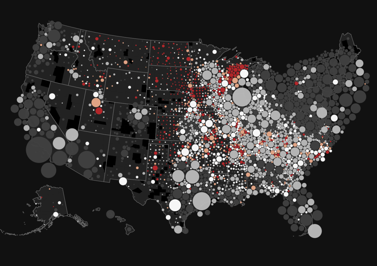
I kept playing with the data afterwards. Using Delphi's open Epidata API, I made time-lapses of doctor visits by county, where each circle is a county sized by the share of outpatient visits due to COVID-like symptoms. One was paired with a data sonification of the same numbers for all of New York State.